The Why’s of the Mudroom
A white mudroom seemed like a bad idea but I knew with all the clutter a mudroom brings I needed a clean slate. Two years later, I am loving the combination of fresh white and rugged floor, dark wood trim and crisp bead board lines. I based most of the design off my favorite design book, A Place To Call Home by Gil Schafer.
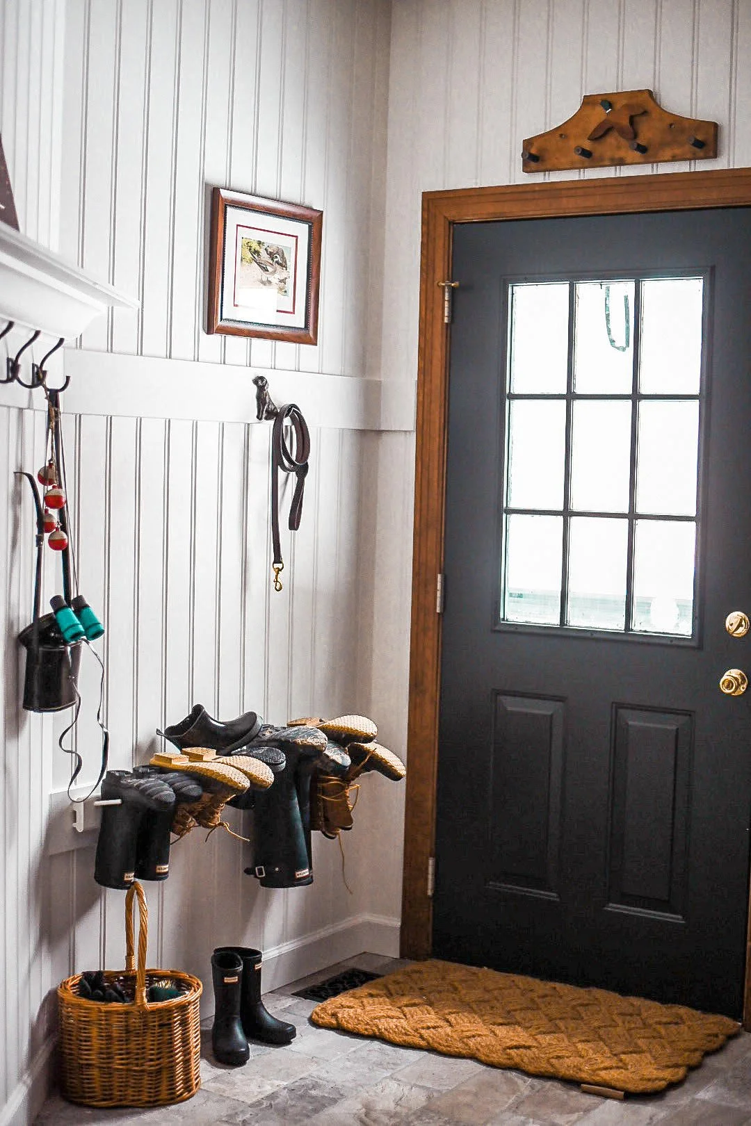
A line up of boots is always necessary in a country mudroom, don’t you think?
We went with a durable ceramic floor that looks like real stone for a fraction of the price. It’s so easy to care for and doesn’t ever look dirty, ha! I had my contractor keep the wavy lines of the tile when grouting so that it looked more authentic.
I loved adding this plaid curtain to the room to soften everything without feeling to “girly.”
As for functional storage, I debated between having custom cabinets built or using an economical curtain. In the end, the curtain won because it felt more in line with the design of the space and my goals for our home. I chose plaid vs. a floral fabric I was eyeing because I really wanted to keep the rustic tone of the home and space.
The walls are covered in a wider bead board that we found at Lowe’s, the extra spacing made it look like tongue and groove for a fraction of the cost. I used BM White Dove on the walls and trim work, FB Studio Green on the door.
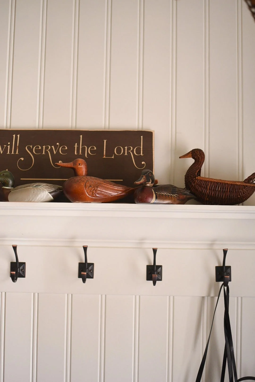
The room now houses my growing collection of antique ducks and is often covered in the florals for my videos and photography. It’s the prettiest, messy space in the house.


